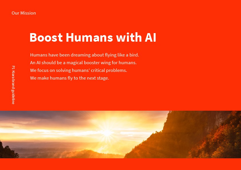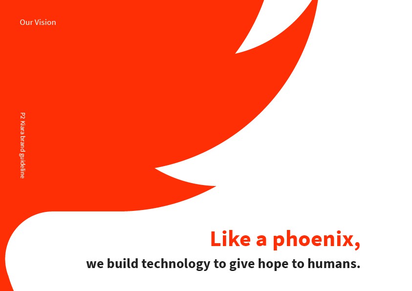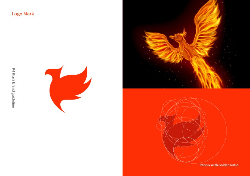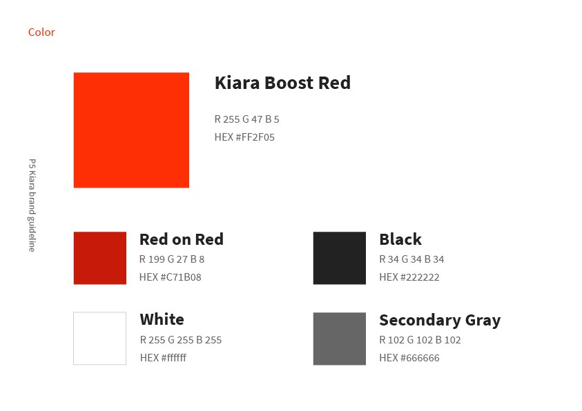
Logo and brand identity for Kiara Inc., the company behind Kiara Translator, a real-time translation app for Slack that helps global teams communicate across languages. Guided by the mission “Boost Humans with AI” and a vision of rising like a phoenix, the mark depicts a phoenix built on golden-ratio circles. A bold Kiara Boost Red palette and clean Source Sans Pro typography give the brand an energetic yet trustworthy presence.

Role
Logo design · Brand identity
Client
Kiara Inc.
Live site
www.getkiara.com ↗
Kiara brand guide: mission, Boost Humans with AI
Kiara brand guide: vision, Like a phoenix
Kiara brand guide: products, We build the future of work
Kiara logo mark, a phoenix, next to a photo of a fiery phoenix
Kiara brand colours: Kiara Boost Red, red on red, black, white and grey
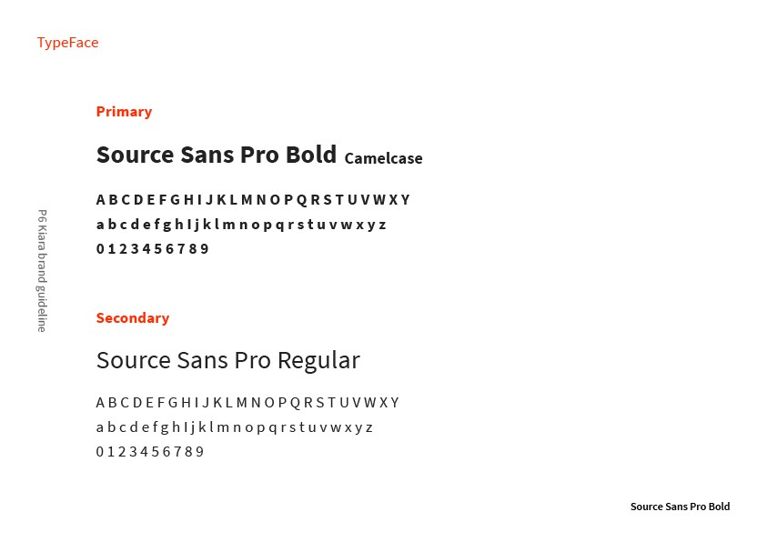
Kiara typefaces: Source Sans Pro Bold and Regular
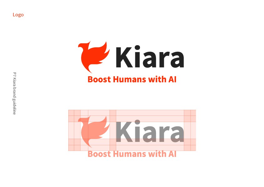
Kiara logo with its clear-space grid
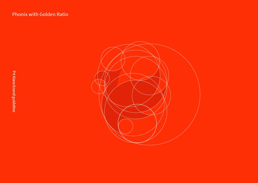
The Kiara phoenix mark built on golden-ratio circles
Previous project
Next project

Contact

Let’s make something warm together.

Commissions, collaborations, or just hello.

A full laundry basket with a teddy bear and a little dog peeking out